Sunday, June 24, 2012
Negative Space and Letterpress
To truly understand letterpress card design and how to use color and the paper, you have to know how to use negative space. There is one exercise I remember doing during art class that really drove this point home. The task was to draw the outline of every shape I could see from my vantage point. I drew the outside edges of a plastic plant, the table, the lamp, the window and the chair. All of a sudden it came to me that everything lives in negative space and my world got pretty large. Now when I look at people, things and spaces, I notice that I observe more of the unoccupied space around people and things. It’s that ability to see the negative space that makes for great design in letterpress, because the negative space is that which when printed is what you feel. If a picture is worth a thousand words then the touch is too. These cards were designed and made by Leslie Ross Robertson and printed using soy inks. I really love her work because she understands negative space and has an appreciation for mid-century architecture and design.
 Modern Damask Three Color Letterpress Card
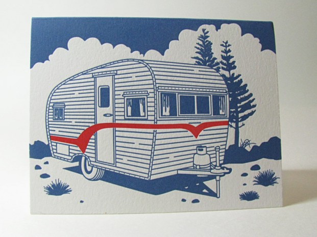 Two Color Classic Air Stream Letterpress
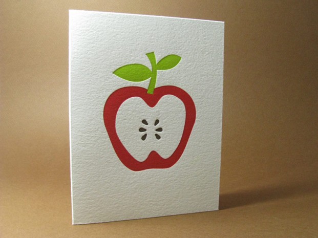 Teacher’s Favorite Apple Card Three Color Letterpress
 Bonsai Tree Three Color Letterpress
 Mid-Century Modern House Letterpress Card
 Surfer Card Three Color Letterpress with Fade
 Flame On Two Color Letterpress
 Chrysanthemums Flower Card in Three Color Letterpress
 Ripe Berries Two Color Letterpress
 Wild Flowers Card Two Color Letterpress
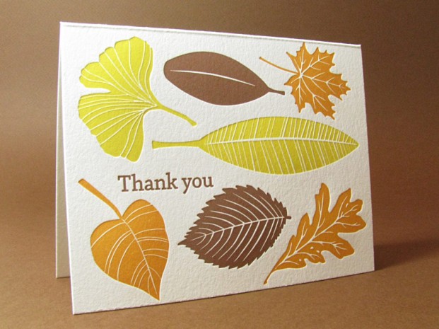 Fall Card Three Color Letterpress
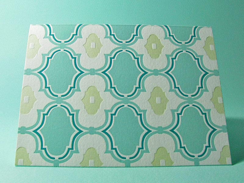
 Mid-Century Modern Connections Card in Three Colors
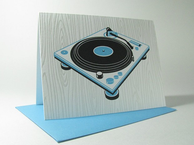 Retro Record in Two Color Letterpress
 Mid-Century Modern Chair and Light in Three Color Letterpress
We hope you enjoyed the photos and if you need to order any of these, get in touch here with your question.
Posted in Wedding Resources | No Comments »
Monday, March 12, 2012
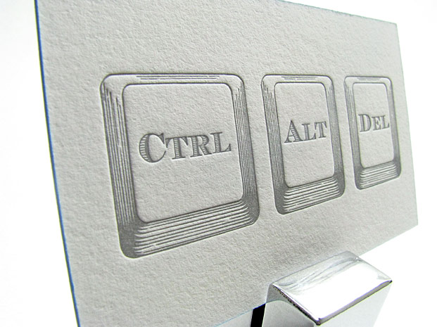
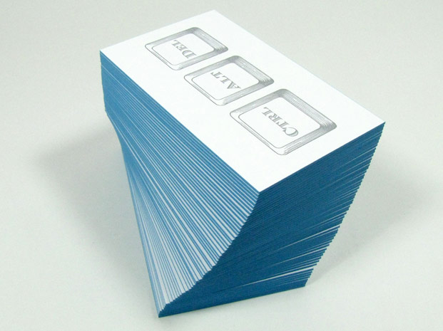
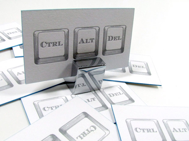
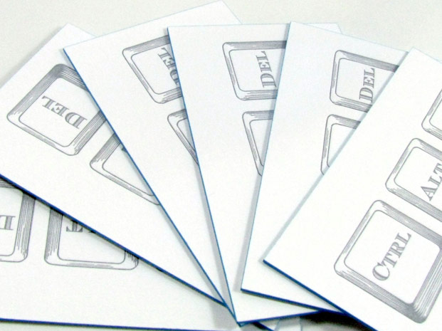
The CIO (Chief Information Officer) painted edge letterpress business card was designed in our studio for a high tech computer engineer with a sense of vintage style. We’d show you the other side, but since he has a security clearance then we’d have to (well, you know the drill). Since our client works in Japan, he is sure to be the envy of every Japanese person with which he meets and goes through the ritual of business card exchange. The soft feel of cotton on 220 LB paper and the crisp letterpress feel that only an antique steel machine can deliver.
Modern Ctrl + Alt + Del keys contrast with a vintage etching style. The sky blue painted edge adds a touch of uniqueness and luxury to these letterpress business cards. Really, if you’re going to have a business card, make it letterpress on 220lb paper with a painted edge! It has the ability to make any ordinary card extraordinary.
Posted in Business Cards, Custom Letterpress Designs, Sample Designs | No Comments »
Thursday, February 9, 2012
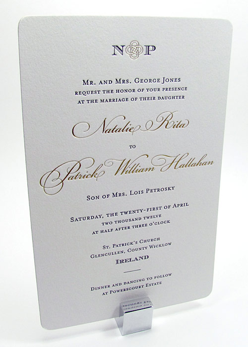
Click on an image below to launch slideshow.
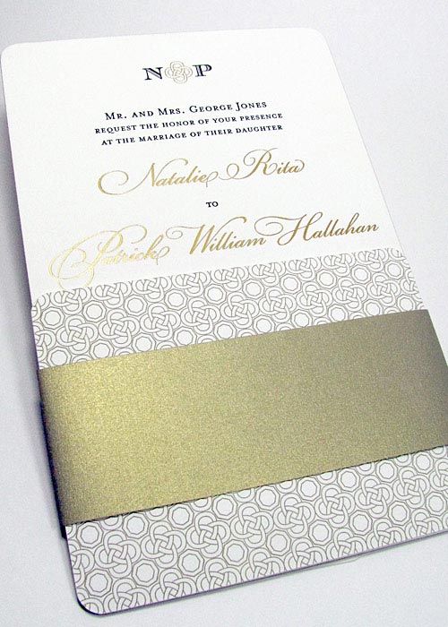
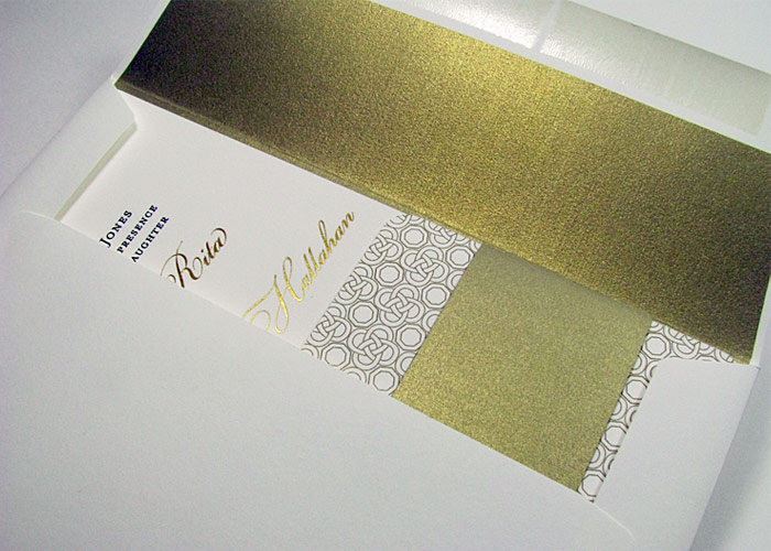
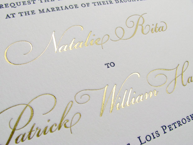
These simple and elegant luxury wedding invitations are printed with shiny metallic gold printing (aka foil stamp) on 220lb cotton paper, made even more striking with a with gold painted edge. Perfect for Ireland destination wedding invitations, featuring a traditional Celtic knot motif taken in a modern direction. There is no better way to turn any invitation into a luxury wedding invitation then by adding a metallic ink foil stamp, we’re ready to work with you on your couture foil stamping project!
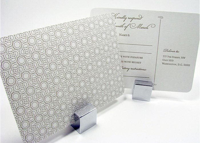
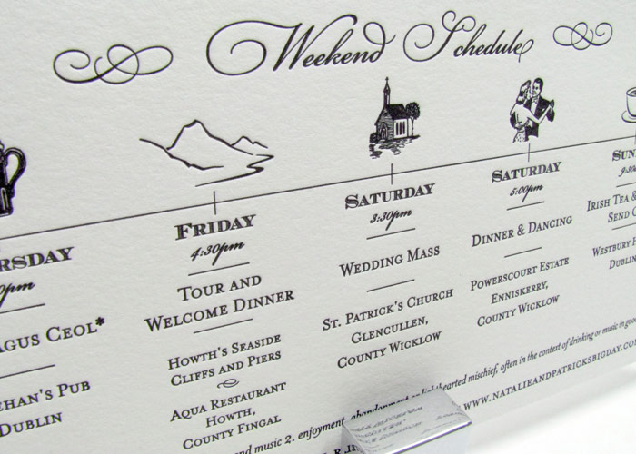
Additional elegant touches include an events card with iconic images, great for keeping guests informed about the days leading up to the big day. In letterpress printing, the piece includes a simple timeline that can be carried around with your guests’ passports and other important documents!
Contact us for a consultation on your own customized foil stamping project, it will be a classic wedding invitation no-one will forget!
Posted in Custom Letterpress Designs, Elegant Wedding Invitations, Foil Stamp Designs, Sample Designs | 2 Comments »
 Modern Damask Three Color Letterpress Card
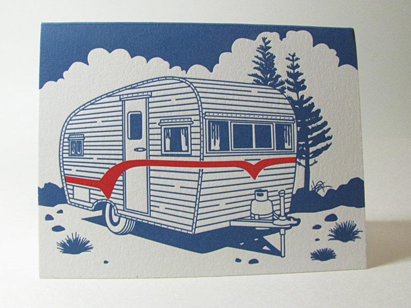 Two Color Classic Air Stream Letterpress
 Teacher’s Favorite Apple Card Three Color Letterpress
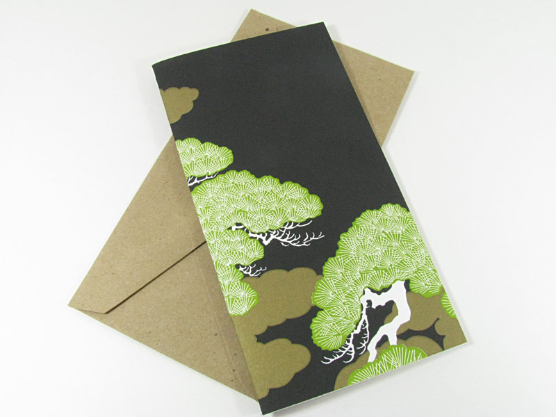 Bonsai Tree Three Color Letterpress
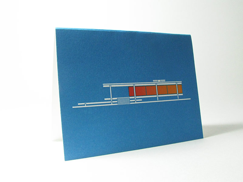 Mid-Century Modern House Letterpress Card
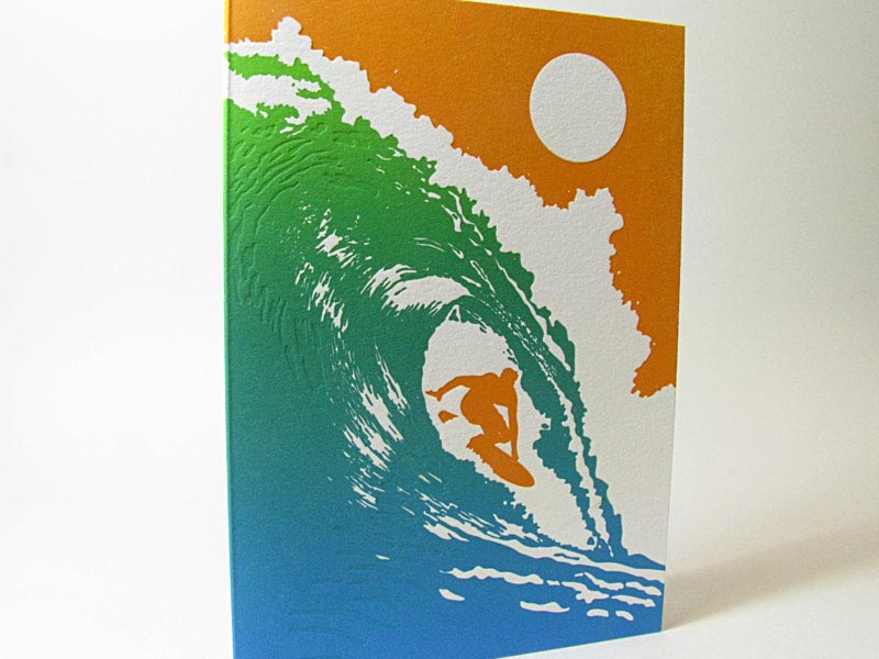 Surfer Card Three Color Letterpress with Fade
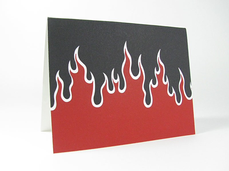 Flame On Two Color Letterpress
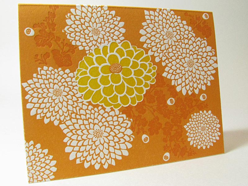 Chrysanthemums Flower Card in Three Color Letterpress
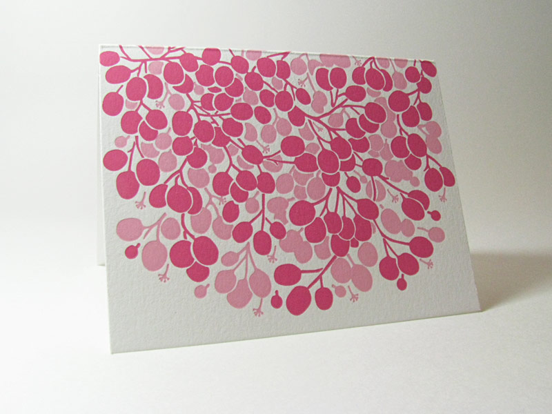 Ripe Berries Two Color Letterpress
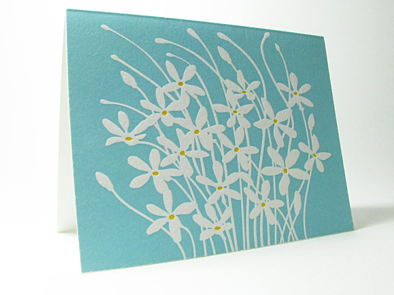 Wild Flowers Card Two Color Letterpress
 Fall Card Three Color Letterpress
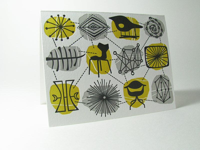 Mid-Century Modern Connections Card in Three Colors
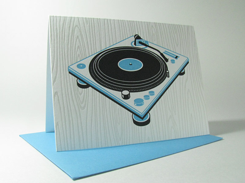 Retro Record in Two Color Letterpress
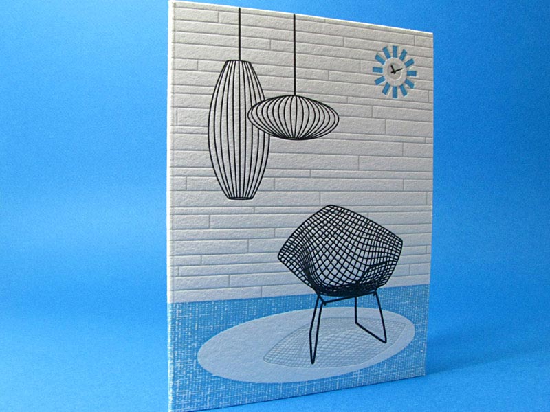 Mid-Century Modern Chair and Light in Three Color Letterpress