Monday, February 6, 2012
Click on an image below to launch slideshow.
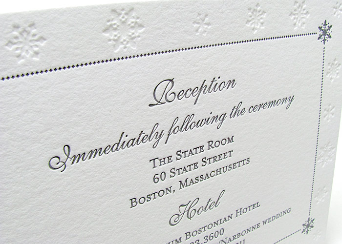
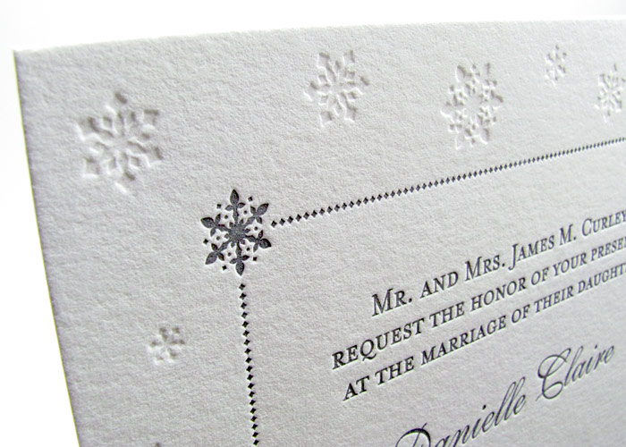
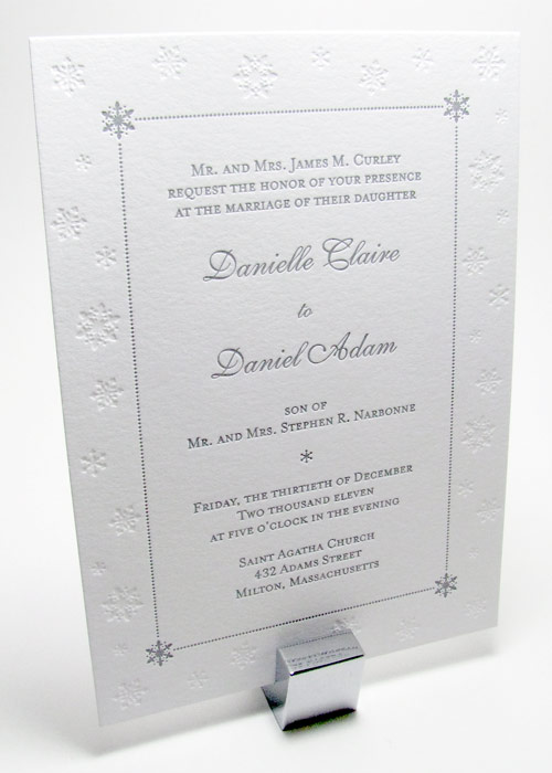
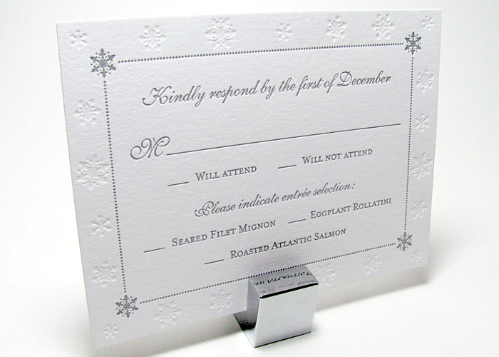
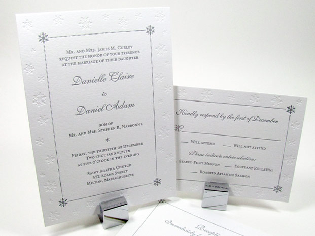
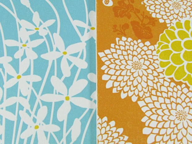
Winter wedding invitations letterpress snowflakes
- Colors & text your choice
- Customizable
- 100% cotton paper
- Matching pieces available
- Pocketfolds available
- Minimum order quantity 50
Sample $10.00

Customized winter wedding invitations printed in letterpress on thick cotton paper, personalized with your colors and snowflake size. Beautiful in white, custom printed with silver ink, or your own winter wedding colors. They’re perfect for announcing a winter wedding with a clean, simple, and elegant wedding invitation design ready to be customized into perfect invitations for you!
A perfect choice for a winter Boston wedding or any snowy winter venue! Please contact us for any questions big or small.
Posted in Custom Letterpress Designs, Elegant Wedding Invitations, Sample Designs | No Comments »
Thursday, February 2, 2012
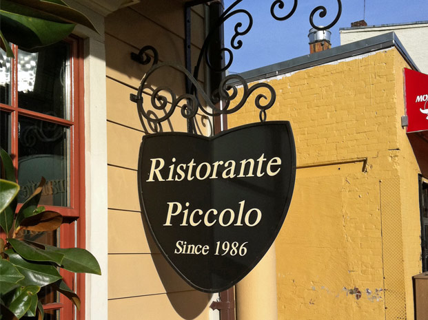
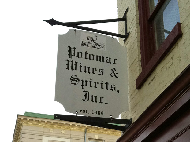
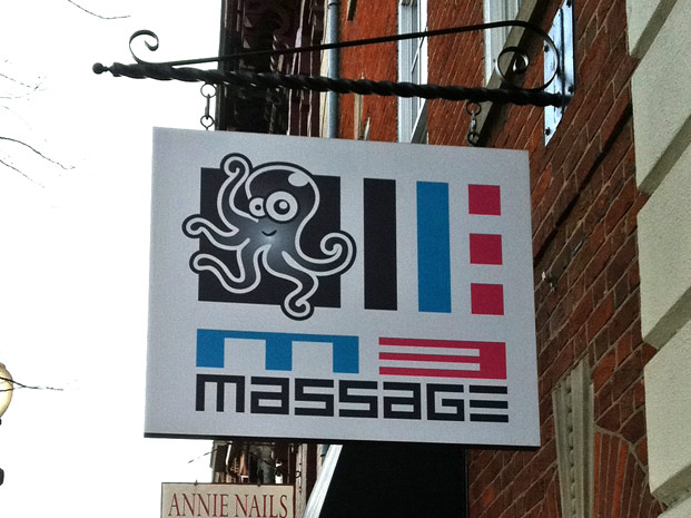
We’ll be posting photos of some of the Notable Signs and Fonts used in the neighborhoods of Washington, DC in the coming weeks. Today’s post came as a great excuse to get an espresso at Baked and Wired in Georgetown. Although it’s a few miles from our letterpress invitation design studio in Cleveland Park in NW, its ALWAYS worth the trip to enjoy their goods and support another local business. My criteria for this post is simple: 1) hanging signs 2) affixed to a building on the 3) route from the studio to caffeine.
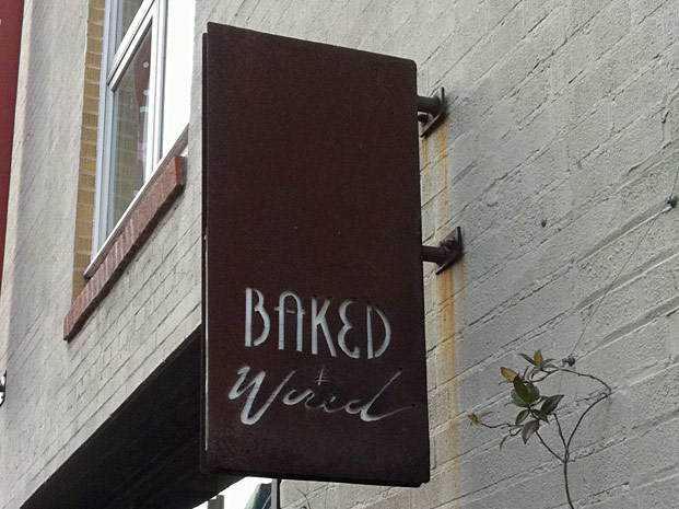
Baked & Wired
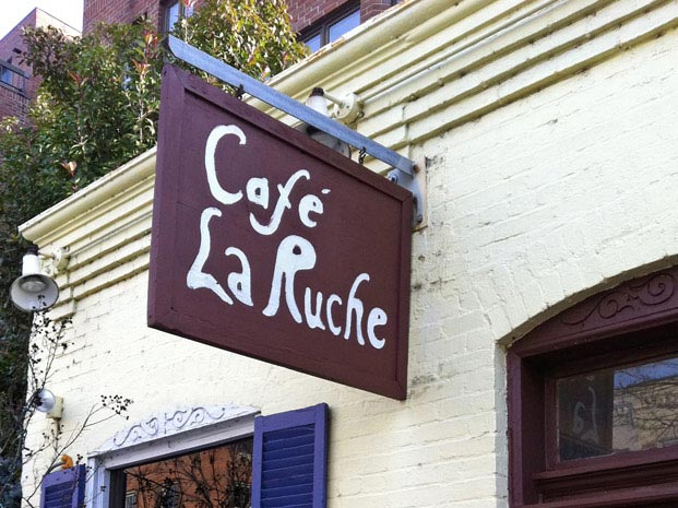
Cafe La Ruche may seem to be the least refined sign in today’s look at signs. But is it really? The sign expresses that fact that inside you’ll be eating at a country French bistro. I love the “accidental” brush stroke of the sign to make it seem even more inviting with a homemade feel.
What I like most about this is the early 90s heavy computer font and the fact that it can’t be missed on M Street, right in the middle of Georgetown.
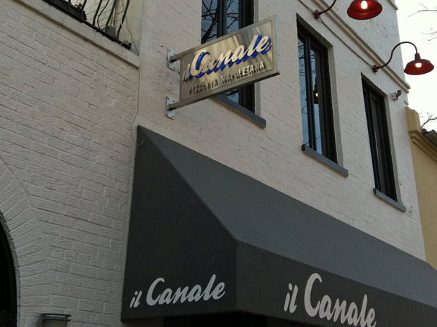
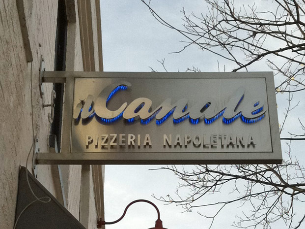
Here’s one where you can honestly say, “Design First, Cost Second!” I love people that have their priorities straight in life. I liked the blue track lit and cut brushed aluminum sign so much, here’s a second look.
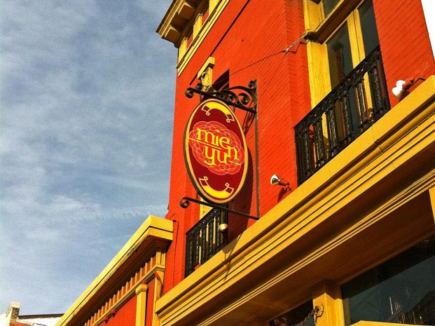
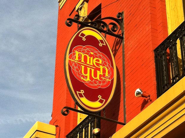
The restaurant Mien Yu on M Street doesn’t really need the signs as the colors tells us plenty of what’s inside–SPICE from the far east. I do like “packaging” design and this was well thought out if you consider the size of the package being the whole building.
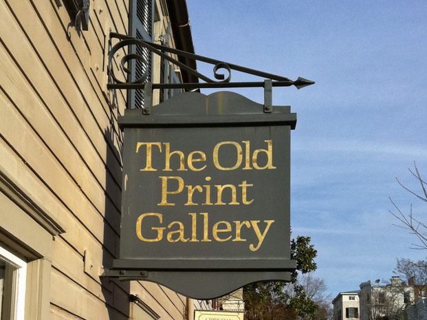
They have what I love…paper, print and design.
Next post on Notable DC Signs and Fonts will be a look at some of the fonts used in the Dupont Circle neighborhood. Here’s a peek…
Posted in Washington DC Event Resources | No Comments »
Thursday, September 22, 2011
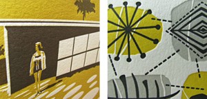
Nothing screams Mid Century Modernism more than having a look at a George Nelson clock next to a cigar pendant lamp and a Harry Bertoia diamond chair. And nothing is more awesome than seeing them printed on these amazing four color letterpress cards. From the wonderful detail of the shadow reflected beneath the chair to the hint of shadow created behind the clock, designer and printer Leslie Ross-Robertson delivers quality in all of the work featured here.
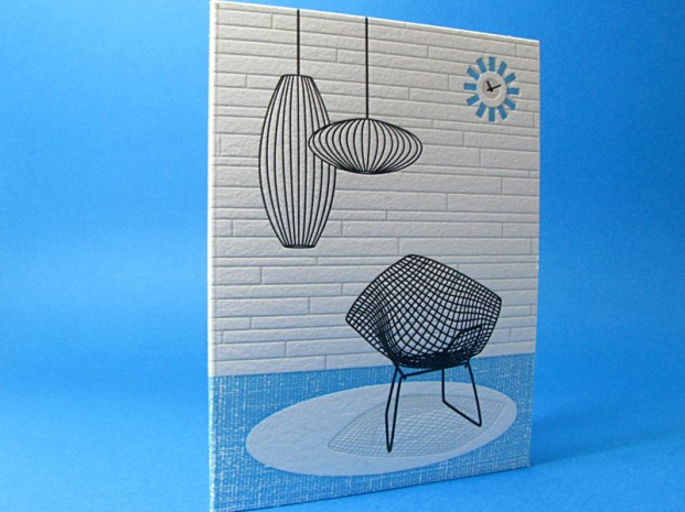
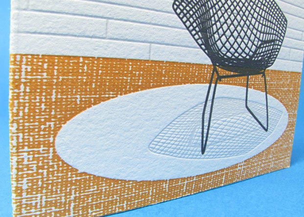
Have a look at some more treasures!
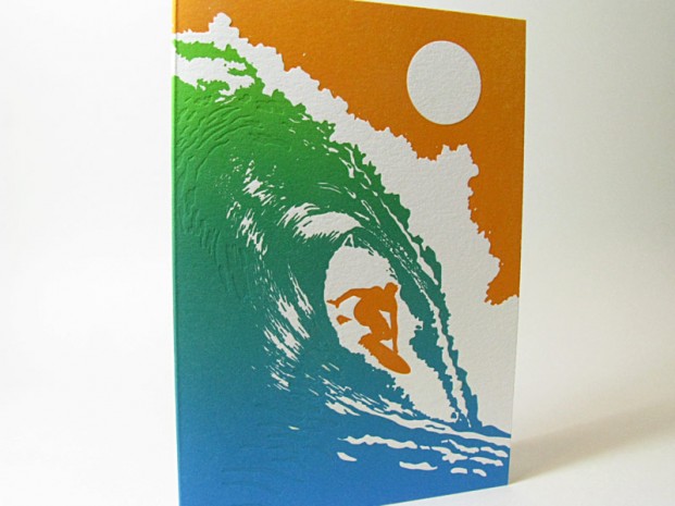
Yes, that is a color fade in letterpress with soy ink.
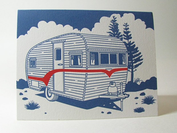
Who do you know that could use an Airstream letterpress card? Neither do we, but it’s great!
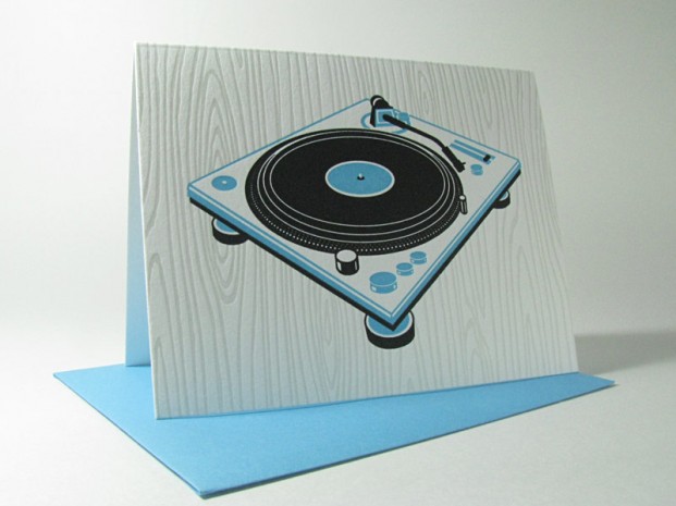
What was your first record? Digby’s was ELO’s Greatest Hits. Rose’s was Thriller.
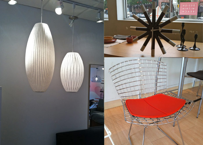
A special thank you to Design Within Reach, our Bethesda neighborhood place to enjoy fine furniture and great conversation on design with their staff.
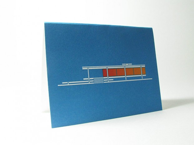
The Farnsworth House in letterpress.
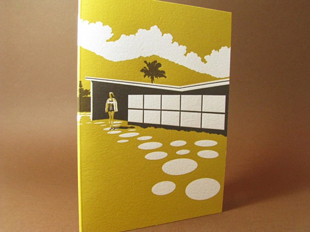
Palm Springs in letterpress, the height of cool!
Posted in Custom Letterpress Designs | 2 Comments »