Introducing the New Digby & Rose Logo
![]()
Working on logos for clients is always fun for us here at Digby & Rose, but somehow we had long avoided upgrading and updating our own logo. There’s just so much more pressure! But at last, we’re pleased to debut the new Digby & Rose logo, which Heather (A/K/A Rose) likes to jokingly say took her one year, one month, one day and five minutes to create.
The Inspiration
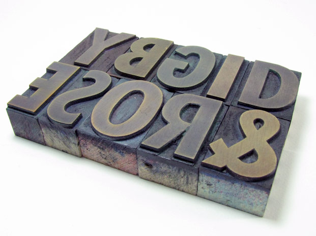
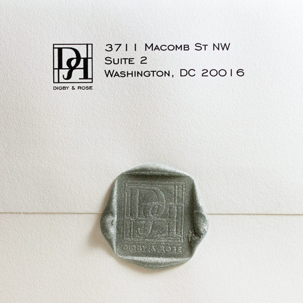
The main inspiration for the logo of course had to come from the world of letterpress. We were thinking about antique wood type, and how it looks when it’s set up in a tray for printing on an old Vandercook. We wanted to take the “D” and “R” from our name and give it a block print flair, with the “R” of course turned backwards.
As much as we like a vintage look, we also wanted the logo to have clean architectural lines that’s representative of our style and brand. So we made it a sleeker form with straight lines and geometric aspect, and a sans serif font for the company name.
![]()
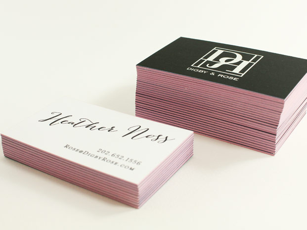
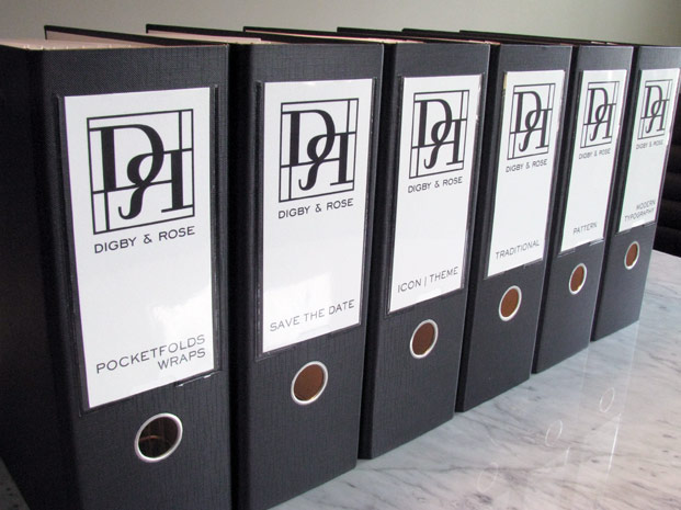
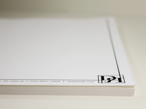
The New Logo in Action
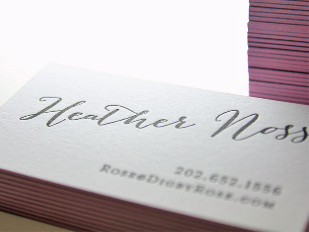
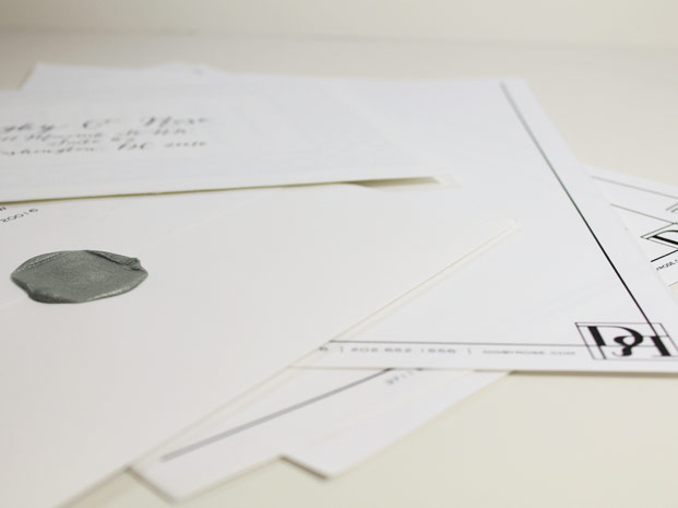
Now our new logo can be seen in all of our new packaging. Our favorite is our new business card, with a silver foil stamp on one side on Curious Skin black paper, adhered to 220lb Crane Lettra with a black letterpress print. And of course don’t forget the lavender edge painting!
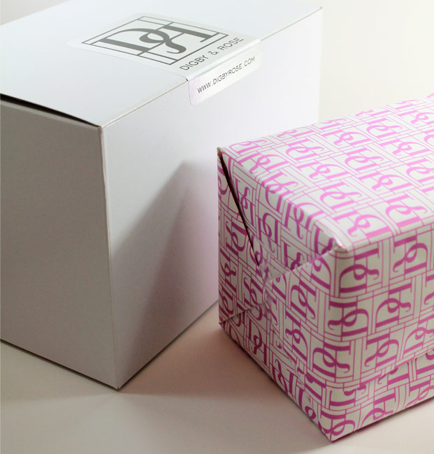
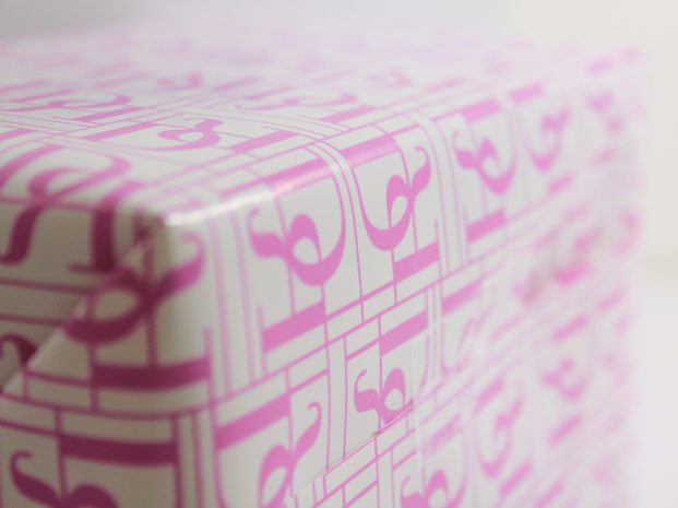
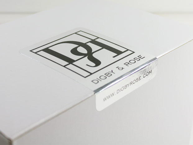
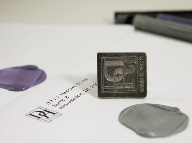
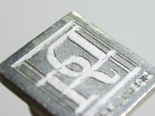
The new logo also makes a great pattern for custom wrapping paper, and on the silver sticker closure for all our outgoing packages. The last thing we couldn’t resist is a new Digby & Rose wax seal. We hope you like the results!
![]()
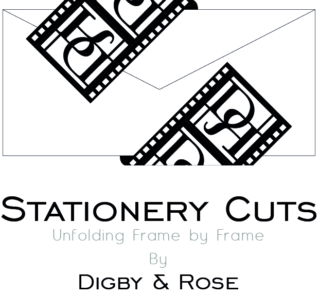
And keep an eye out for our new Stationery Cuts videos coming soon, bringing all the gorgeous paper to life, frame by frame in stop motion!

I like them both. Totally different feel. Your designs are beautiful which matches the first, but men may be more attracted to the new logo. They really are both strong, just different messages. Good work!
Thanks for the compliment. Since 95.2% of our clients are women, we were hoping to balance it out a bit. ; ) But we really just wanted to express everything we loved about letterpress printing in a logo and stay with the clean lines which permeates through our collection.